Our logo and guidelines on how to use it.
Primary logo
Our logo is our signature and the foundation of the brand’s visual identity.
In accordance with the Official Languages Act, there are two official versions of the Bank’s identifier. On our English website, English appears first and French first on our French website.
Secondary logo
Our secondary logo adds flexibility and enhances the brand’s personality.
Colours
Our logo has four colour variations.
BoC Blue
Use BoC Blue colour on all bright backgrounds and surfaces to ensure a greater contrast and visibility.

BoC Yellow
Use the Yellow BoC colour on all darker backgrounds and surfaces to ensure greater contrast and visibility.

BoC Black and White
Use only in case of technical limitations, such as black and white document printing.


Clearance
To aid legibility, a minimum clearance space surrounding the identifier must be respected. For instance, no other elements, either graphic or text, should appear within the perimeter of the clearance space.
The logo should appear on the top left, never in themiddle or below.
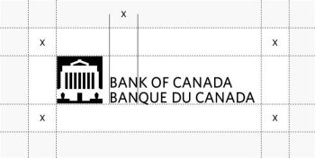
Description: Clearance
The clear space around the logo has been defined by the letter height of “BAN” that create a uniform square.
The margins identified as “X” height can be seen in the example. The amount of clear space around our logo should be equal to, or greater than, the “X” height. A minimum clearance space surrounding the logotype must always be respected. For instance, no other elements — either graphic or text — should appear within the perimeter of the clearance space.
Size
To ensure proper legibility of the logo in print and web, the following minimum size 5.50 cm (print) or 175 pixels (digital) should be maintained.
Incorrect uses
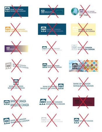
The identifier should not be altered in any way, nor should it be exaggerated in size.
Examples of unacceptable alterations:
- rotation
- skew
- over/under sizing
- disproportionately resized (i.e., stretched)
- colourizing
- cropping
- picture effects (for example, bevel/emboss, reflections, 3D)
